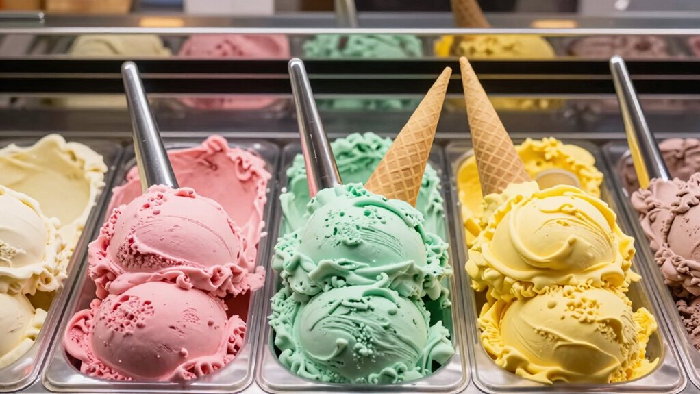

You can make a gelato counter look vibrant without chaos by focusing on effective color coordination and artistic arrangement. Carefully grouping similar shades and creating smooth gradients helps your display flow naturally, avoiding clutter. Skilled scooping and symmetrical patterns add order, while strategic lighting highlights the colors’ richness and freshness. When you pay attention to these details, your counter becomes both eye-catching and organized. Keep exploring to discover even more ways to elevate your presentation.

Get baking supplies delivered free — and shop member deals
- Fast, free delivery on millions of items
- Access to Prime Big Deal Days deals on October 6–7
- Prime Video, Amazon Music and more included
Key Takeaways
- Thoughtful color grouping and gradients create visual flow and prevent clutter.
- Symmetrical and concentric arrangements maintain order and draw the eye smoothly.
- Consistent scoop sizes and shapes showcase vibrancy while emphasizing professionalism.
- Proper lighting enhances color richness and highlights freshness without chaos.
- Careful spacing and balance of shades prevent clashing, ensuring a harmonious display.
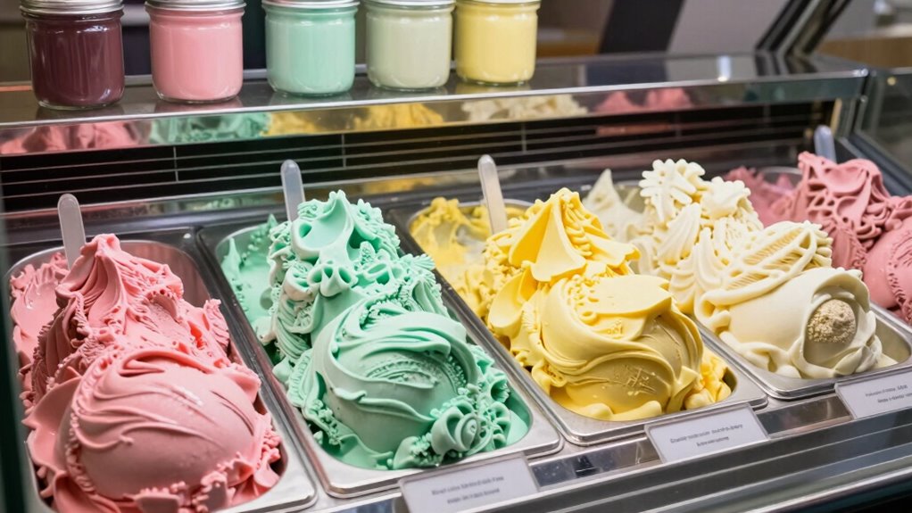
Walking into a gelato shop, you might expect a chaotic splash of colors and flavors, but savvy design turns this vibrant display into an organized feast for the eyes. The secret lies in how the gelato is presented—an artistic presentation that balances creativity with order. Instead of an overwhelming jumble of hues, each flavor is carefully arranged to create visual harmony. You’ll notice how the different colors are spaced thoughtfully, avoiding clashing contrasts that could make the display feel chaotic. Instead, the colors complement each other, guiding your eye smoothly across the counter.
Color harmony plays an essential role in making the display appealing without feeling overwhelming. Designers select shades that work well together, often grouping similar tones or creating subtle gradients. For example, pastel pinks, soft greens, and creamy whites might sit side by side, forming a pleasing progression that’s easy on the eyes. When bold colors like bright orange or deep purple are introduced, they’re balanced with neutral tones or muted shades nearby. This careful coordination prevents the display from appearing cluttered and instead enhances each flavor’s visual appeal. Additionally, understanding color coordination can help create a more visually appealing display that balances vibrancy with harmony.
Another aspect of artistic presentation is the way the gelato is scooped and arranged. Skilled staff often use symmetrical patterns or concentric circles, which naturally draw attention and create a sense of order. When each flavor is neatly shaped and consistently sized, it reinforces the feeling of professionalism and care. This consistency also allows the vibrant colors to shine without distraction, emphasizing the beauty of each unique hue. Proper lighting plays a subtle but essential role as well. Proper illumination highlights the richness of the colors and makes the overall display feel inviting rather than chaotic. Soft, even lighting ensures that no particular section feels overly bright or dim, maintaining the visual balance. When combined with thoughtful arrangement, lighting enhances the artistic appeal, making each scoop look tempting and fresh.
As an affiliate, we earn on qualifying purchases.
Frequently Asked Questions
How Do Gelato Shops Choose Their Color Schemes?
You’ll notice gelato shops choose their color schemes based on color psychology, aiming to evoke specific emotions like happiness or calmness. They consider branding and aesthetics, selecting colors that align with their identity and appeal to customers. Bright, vibrant hues attract attention and create a lively atmosphere, while softer shades convey elegance. By carefully combining these elements, shops craft a colorful, inviting environment without feeling chaotic.
What Materials Are Used for Vibrant Gelato Display Counters?
Imagine the counter as a canvas, where vibrant acrylics bring gelato flavor diversity to life. You’ll find materials like high-quality acrylic or tempered glass, chosen for their durability and easy cleaning, symbolizing trust and freshness. These materials showcase the colors vividly, making each flavor pop without feeling chaotic. Their resilience guarantees your display stays beautiful over time, inviting customers to indulge in a rainbow of delicious choices.
How Is Lighting Designed to Enhance Gelato Colors?
You can enhance gelato colors by carefully designing lighting with specific angles and color temperatures. Position lighting at angles that highlight the vibrant hues without creating glare, making the gelato look more appealing. Use warmer color temperatures to bring out rich, inviting tones, or cooler ones for a fresh, clean appearance. This thoughtful lighting setup guarantees each flavor’s color pops, keeping the display lively yet organized.
Do Color Choices Influence Customer Preferences?
Yes, your color choices greatly influence customer preferences. Using color psychology, you can evoke emotions and attract specific customers. Bright, vibrant hues like reds and yellows create excitement and draw attention, while cool tones like blues and greens promote a sense of calm and freshness. By strategically selecting colors, you enhance customer attraction, making your gelato counter more inviting and memorable, ultimately encouraging more sales and repeat visits.
What Maintenance Is Required to Keep Gelato Counters Visually Appealing?
To keep gelato counters visually appealing, you need to follow consistent maintenance routines like regular cleaning and monitoring for spills or smudges. Focus on color coordination by ensuring each flavor’s container remains vibrant and tidy, which enhances the overall aesthetic. Regularly check the lighting to highlight the colors and prevent dullness. By maintaining a clean, organized display, you create a tempting, colorful presentation that draws customers in effortlessly.
Conclusion
As you now see, a well-organized gelato counter proves that too many colors don’t have to mean chaos. When every flavor is thoughtfully arranged and maintained, the vibrant display invites customers in without overwhelming them. Remember, a picture is worth a thousand words, and in this case, a colorful, tidy counter tells its own sweet story. Keep it neat, keep it lively—because a little order makes the colors shine even brighter.
Halloween Picks
halloween
As an affiliate, we earn on qualifying purchases.